
PROJECT
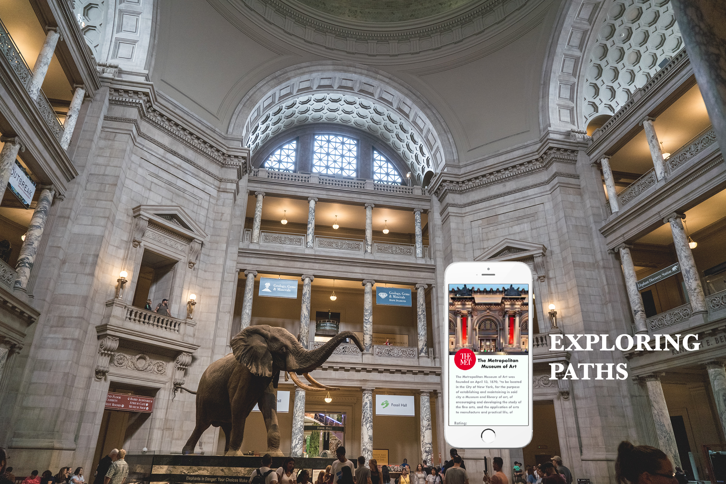
Exploring Paths
MY ROLE
User Research
UX/UI Design
Prototyping
Usability Testing
TOOLS
Adobe XD
SUMMARY
I designed a special gamified feature for an existing mobile app and website that brings you the most extensive collection of at-home and in-person, youth-friendly experiences and destinations.
Exploring Paths started as a non-profit cycling experience dedicated to bringing bike riding adventures to youth living in NYC. Now with a mobile app and website, Exploring Paths provides youth with the ability to get out and explore their community and other places across the world. “Get out” either in-person or virtually from their own homes.
PROBLEM
The company has a new mobile application and website to help users explore and experience new destinations, with its living platform. The company has reached out to me to design a new gamified passport feature to increase engagement among users and make things even more fun and entertaining, continuing their exploration and motivating them to explore as many destinations as possible.
SOLUTION
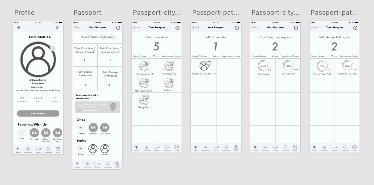
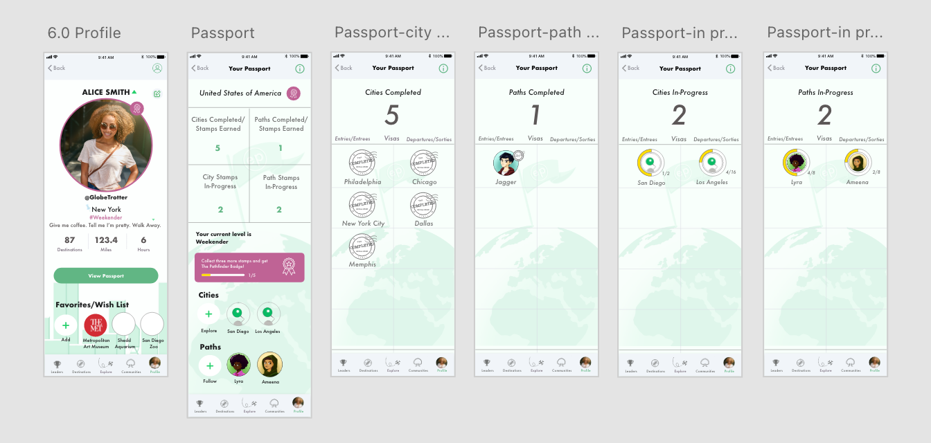
To gamify the product, designing a virtual passport feature within the mobile and desktop version so that users can earn stamps as they visit various destinations in cities around the world. The stamped section of the passport allows the users to compete against themselves and other users.
DESIGN CONSTRAINTS
Designers only had a duration of four weeks (roughly 40 hours) to work on the project.
Designers had to obtain parental consent and abide by the COPPA rule in order to interview and test participants in the target group.
TEAM
I collaborated with another designer, a development team and the head of the company.
TARGET USER
Youth (ages 13-18), in addition to teachers, grandparents, parents, caregivers with younger children as well.
Phase 1: Research & Discovery
HEURISTIC ANALYSIS
Using Jakob Nielsen's 10 general principles for interaction design, I conducted a heuristic analysis to help identify any usability issues in the present Exploring Paths interface design for both the mobile app and website.
One of the issues I found was evident within Consistency and Standards (both internal and external) demonstrated in the website and application. The internal inconsistencies and standards are with links and CTA buttons vs. non-clickable pieces of information. The color green is used widely throughout the app that something is “clickable” (link or CTA) which leads to another piece of information or action. However, it has shown inconsistency in a few instances in the app and website (as shown below). The external inconsistencies with the app and website are that the icons used in the navigation bar are not very standard in relation to other apps, but because the app indicates in words (labels) indicating what they are it isn’t as much of a problem as it would be without them (navigating through the app).
The website is “clickable” and leads to the website, whereas the date is not, yet still in the same green color, making it look like it is also clickable.
The green duration and distance sections look as though the user can click on them however they are not CTA’s.
All of these in green are “clickable” CTA’s
The closeout “x” at the top of this pop up should be red to be consistent, and match real world conventions.
Another major usability issue was noticeable in the areas that help users recognize, diagnose and recover from errors. The app and desktop version notify the user when there has been an error in most cases found in plain language in the instance of entering the wrong username or password or if something else has gone wrong. However, the message is very small at the top of the screen in the app and may go unnoticed by some users. In many instances when choosing a virtual option, when the user clicks on “Go Now” on most virtual tours nothing happens, there is no feedback or error message and it does not lead the user to another action or any information, it just does nothing. Something with the link might be broken or unavailable but there is no way for the user to know and is a major usability issue.
The last major finding was related to areas of help and documentation. The Desktop version has a section in “Profile” for “how it works” where the user can find a lot of helpful information and find answers to common questions. However, there are no help centers or documentation available in the app. Users have no way of getting help to user questions.
In conclusion, the Heuristic analysis identified the most important areas to focus on for improvement for the app which is fixing the broken links, staying consistent with internal and external standards and adding help or documentation centers for users. And for the Desktop version, staying consistent with standards is most important. The full report with all heuristics and scoring can be found here.
COMPETITIVE ANALYSIS
After conducting the heuristic analysis to identify some problems present in the current app and website, I decided to see if there were any competitors in the same industry as Exploring Paths. I discovered many exploration/travel apps that helped identify locations in cities for adults to explore but nothing like it designed particularly for youths (only ones that included scavenger hunts, bingo, and trivia about different cities they are traveling to), not to physically encourage the kids to go out and explore these sites/locations in-person. Then, I searched for some applications and websites where users earned some kind of rewards/badges/trophies to see what sort of solutions other companies have developed for a similar feature such as what the company is trying to accomplish with the creation of a virtual passport.
Phase 2: Ideate
Based on previous research obtained by the company, the target group of users are youth and teens that love to play games, are extremely competitive and like to “win” and like to see how they are doing in relation to others using the application. Based on this knowledge of the users and knowing the requirements desired by the client I developed some user stories.
As a user I want to be able to see how many stamps I can collect.
As a user I want to be able to see how many cities and destinations I have visited/completed.
As a user I want to be able to see how many destinations I need to visit in order to receive a stamp.
As a user I want to be able to see how I rank in relation to other users.
As a user I want to be able to visualize my accomplishments and rewards.
Phase 3: Interaction Design
SKETCHES AND LOW FIDELITY WIREFRAMES
Using the research and information obtained I sketched out some possible mobile and desktop screen designs. From there, I created low fidelity wireframes, using Adobe XD.
Phase 4: Visual Design
HIGH FIDELITY WIREFRAMES AND PROTOTYPING
After presenting the designs to the company and the development team I received feedback and suggestions to incorporate in the high-fidelity wireframes. I was granted access to all company design assets to create the high-fidelity screens for both the app and desktop versions and developed a quick prototype for testing.
Phase 5: Test & Iterate
USABILITY TESTING
Due to time constraints and children protection privacy and rules, I was unable to collect data and feedback from the main target group (youths ages 13-18). If given more time, I would have definitely liked to obtain feedback from the target group as well. However, I referred to the next best thing, which are users that are parents, teachers and caregivers of the target group that will also interact with the application and website because of their children. I conducted five remote usability tests on the virtual passport feature using AdobeXD and the Zoom platform.
I asked the users to complete a few tasks to see if the features design was functionally intuitive and easy to use to complete the tasks successfully. Can users complete tasks and navigate through the feature design efficiently and with ease?
ITERATION
I received some helpful feedback from users pertaining to the overall visual design, possible usability issues and information regarding the explanation of how the whole passport feature works in general.
Based on the feedback given from users I was able to make a few iterations on the designs and delivered the final feature to the company. (Final designs are unavailable to showcase at this time due to company sensitive information and app/web development).
INSIGHTS & TAKEAWAYS
This was my first experience working with a real-life company/client and development/design team. I learned so much by having the opportunity to collaborate and bounce ideas off of everyone involved. Designing products that the company/client is happy with (while including all requirements desired), along with what the development team can put into action while still keeping the users as the primary focus can be extremely challenging but so rewarding when the final product is complete.